In June 2018, Verizon launched the transformation of My Verizon, the online hub for its post-paid customers. Each page is designed to dynamically update throughout the month with personalized and contextualized messaging that reflects the user’s account status. The experience serves up the right information in the right place at the right time and promotes self-service, aiming to deflect calls to customer care, a major expense for the carrier.
As a design lead, I worked across all four teams: focusing on My Orders and Ubiquitous elements but also providing oversight for the creative across the other teams. My main responsibility was to ensure consistency in design across the entire experience to deliver results that are both human and functional.
Introduction

What was our challenge?
Over 150k customers call in each month, costing Verizon close to $23 million each year.
To dramatically reduce their monthly customer calls, we built a reimagined responsive site that serves as an intuitive personal guide to provide the customer the solutions they need, when they need them.

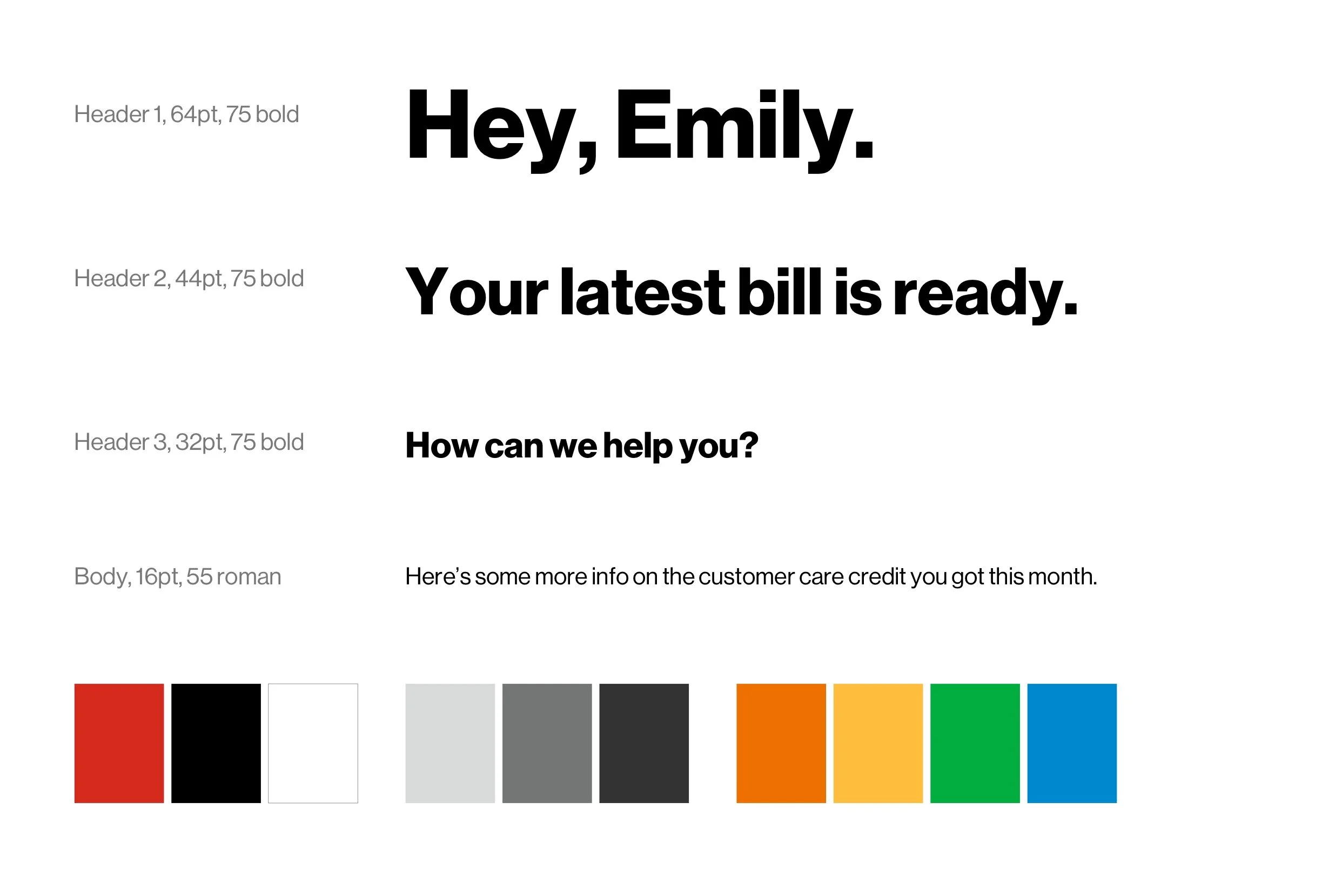
Look and feel
With plenty of white space and minimal use of color and imagery, the large headlines stand out—making it easy for our customers to find what they need, without any of the distraction.
Transformational at its core (experience, design and strategic)
Scaleable design systems
Data-driven approach with data architecture evolution
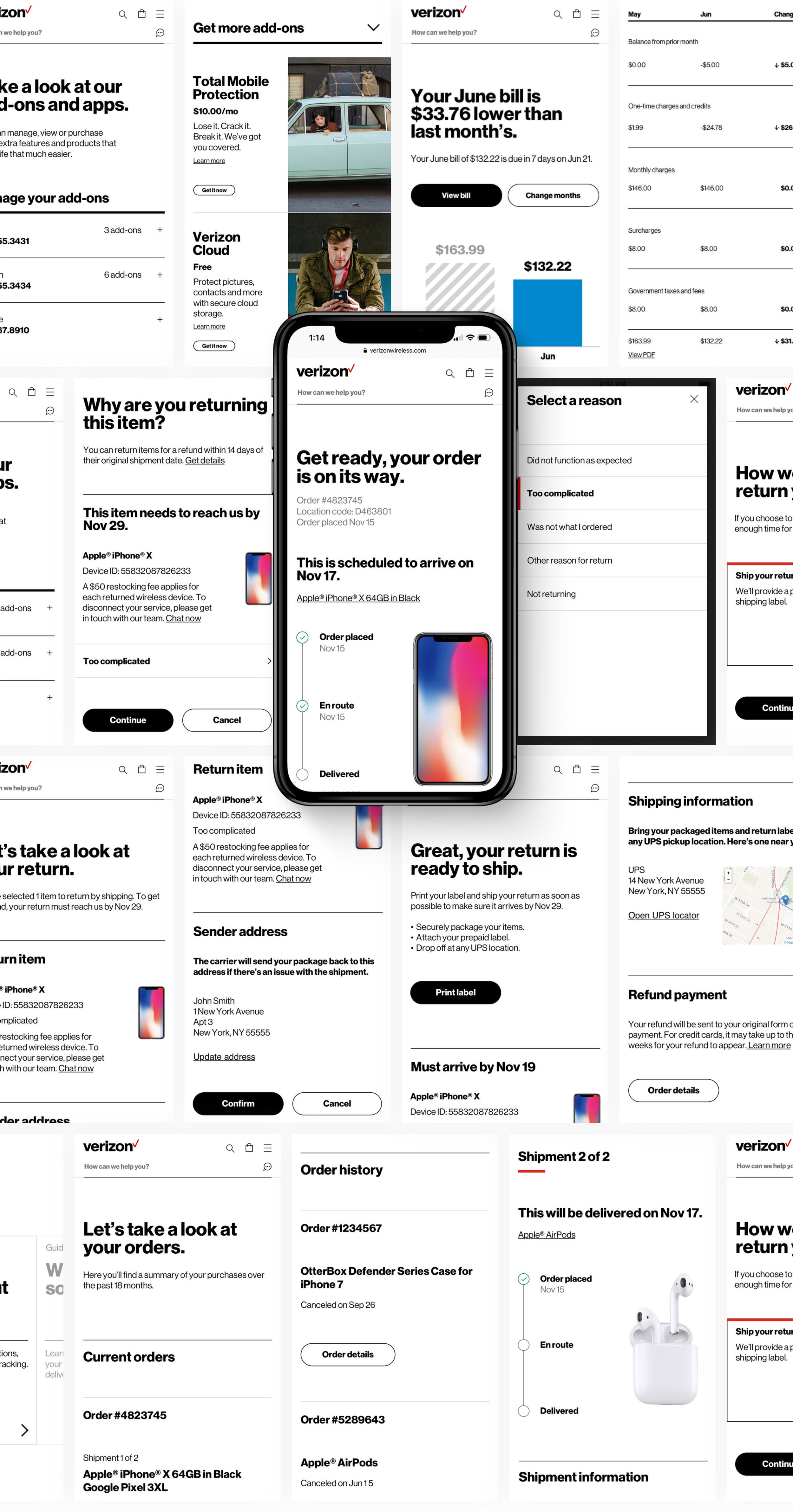
Landing page
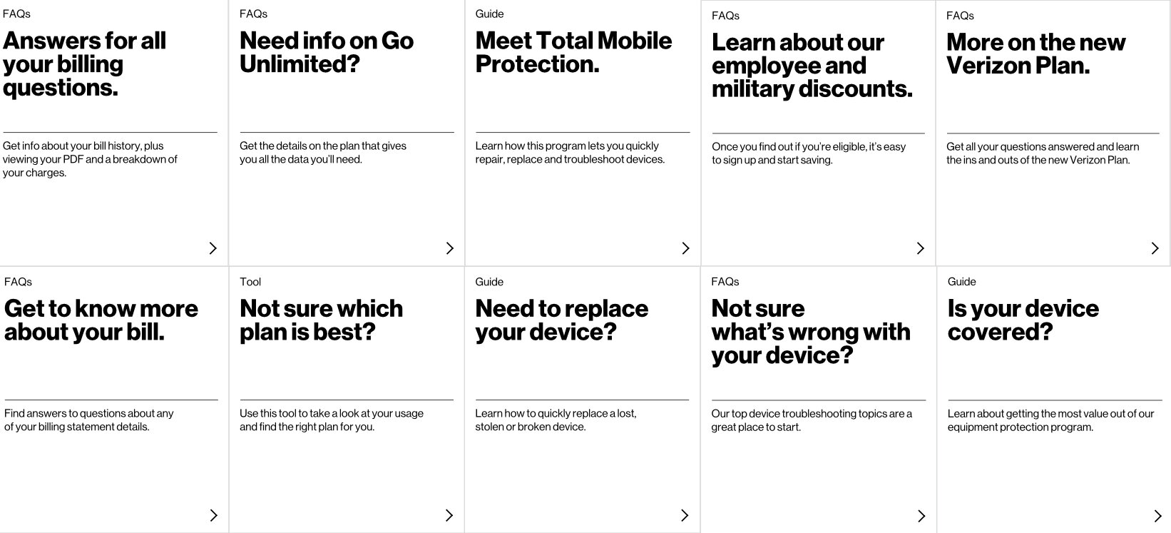
The landing page, also known as the Discover Hub, informs users at a glance about their account status. Key information and actions are captured in Live Tiles, anticipating on the user’s needs and reason for visiting their account. The search bar at the top of the page serves up quick answers, helps users navigate or can escalate to a Verizon representative to offer live support.


Results
Mobile sales conversion rate rose 15.6x
Overall usage up over 50%
Bill payment within the app increased from 68% to 85%
Autopay enrollment raised by 27%